Empirical Color
For the past couple of months, my students at The Safehouse Atelier have been grinding away (and making great progress) on dozens of color studies. Last time, while waiting for the light to change, we started talking about the purpose of all of this rigorous color mixing. Obviously, being able to match a given color with reasonable accuracy is a basic skill for any representational painter. But we're pushing for a little more and the reason is this: I really believe that that extra bit of color accuracy is where a special kind of magic lives.
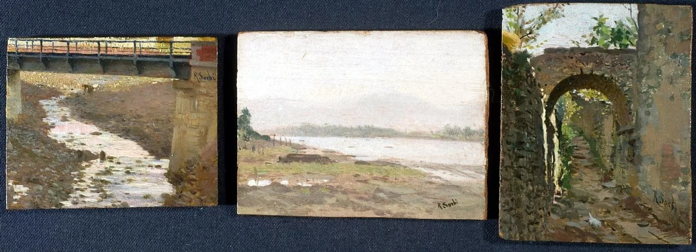
In an effort to explain myself, I showed them some work by one of my personal color inspirations, the 19th century Italian painter Raffaello Sorbi. My first encounter with Sorbi's work came by way of a trio of little sketches painted outdoors. They were modest in size and scope, but I felt electrified looking at them. In less than a square foot of space, Sorbi penned a beautiful ode to vision, three celebrations of his intense love for nature.
Sorbi didn't always reach these heights, particularly in his early and very late paintings, but his best work possesses a rare and striking beauty, a color eloquence that transforms facts into poetry. The effect is mesmerizing, but also initially jarring. Searching for an explanation, I'm inclined to agree with Hawthorne, that maybe "there is nothing so surprising as truth."
In my mind, this kind of painting demands a naturalist's disposition: a voracious curiosity about the world and a desire to evaluate it with fresh eyes. It requires a ruthless honesty and a commitment to be fully aware and present at all times. It depends on having the discipline to never repeat the same color by formula, to investigate carefully and to revel in the variety of experiences that nature offers. It's an exhausting and (probably) impossible goal, but a worthy one to aim for, and one fraught with immense rewards.
This approach creates a "color environment"-- a matrix in which every note is related to every other note in perfect harmony. There is no room for slurring the hue, value or chroma; everything must be articulated clearly and decisively. When done right, this creates an incredible feeling of light, atmosphere and space. Once this matrix is set up, it's possible to modify or invent colors within it, so long as the new mixtures do no disturb the large, overall statement. In fact, Sorbi's studio work is all the more remarkable because it preserves the beautiful color framework of his plein air studies.
Of course, all of this is not to say that beautiful color can't be borne from a more abstract, design-driven sensibility. There are innumerable examples of first-rate non-naturalistic color harmonies. But there is a tension, a simultaneous vulnerability and ruthlessness in this empirical approach that I think is extremely appealing and worthwhile. It represents an openness and humility, framed by rigor and discipline.
Wherever students may take their painting, I hope that they venture forth with discipline, honesty and curiosity.


